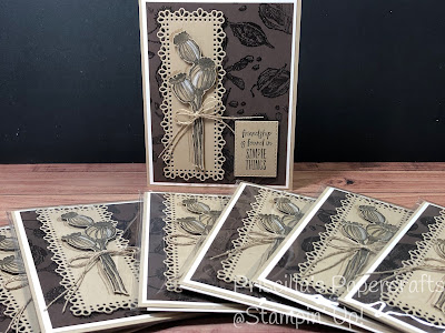
During the past few new catalog releases, my Ink Masters team members have participated in a card swap. We all make a card, using new products from the upcoming catalog, and send them to everyone who is participating. This month we had 7 of us, and we agreed to use something from the soon-to-be-released January - June 2021 Mini Catalog.
I chose to use the new stamp set, Enjoy the Moment, and here's my swap card:
For this swap, everyone agreed to make their own background paper. So I decided to emboss my background with Clear Embossing Powder. The images were stamped on Early Espresso cardstock, using Versamark ink, and then heat embossed.
The main seed pod image was stamped on Crumb Cake with Early Espresso ink, then colored with Crumb Cake Stampin' Blends to give it more depth. I also used a Chalk Marker to highlight them, and then I fussy-cut them out.
But my first try at this card was slightly different. I actually heat embossed the background using White Embossing Powder - look at the difference:
I also used a Whisper White Ornate Layers frame instead of the Crumb Cake in the card above. But after finishing it, I thought it looked to busy.
What do you think:
So I went to my husband and asked for his opinion (although I truly KNEW which he would pick), and sure enough, he felt the white one was too "in your face". So I opted to recreate the other for my team.
Isn't it interesting to see how just one simple substitution can change the entire feel of a card? Sometimes you just have to experiment to find what you love!
Enjoy the Moment will be available in the January - June 2021 Mini Catalog. Do you need one? Drop me a line and I'll tell you how you can score your very own copy for FREE!


4 comments:
When I received this stamp set at Onstage my first thought was what am I going to do with it. But the more I looked it done more I could see possibilites. I like your idea f2f or the background. Thank for sharing your ideas. I agree I agree the white embossing powder free your attention away from the center point of the card but could be good with a more colorful design.
Thanks for confirming my choice, Terry! I agree that the white background is too busy, but you gave me an idea to try it again using a more colorful design. Stay tuned; I may be back with another version!
Love your cards, but the crumb cake would be my style…I’m going to try it as a sympathy card. BTW - my husband also serves as my creative consultant! :-). Thanks for sharing!
Thanks, Vicky; this would make a lovely sympathy card. And don’t you love our husband consultants?
Post a Comment