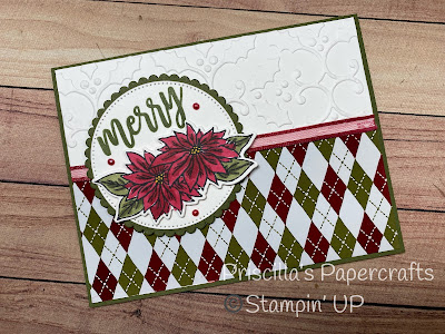
I've got a pretty Christmas card today that was one of our Sunday Crafternoon class offerings. It features the pretty Shining Christmas DSP - the bottom half of the card is foiled, for a really beautiful shine!
This simple layout allows the DSP to "shine" (no pun intended) without taking away from the focal image of the poinsettias.
These were stamped with an image from Rustic Crate, colored with Stampin' Blends, and cut with the coordinating Rustic Crate dies.
Mounted on a Stylish Shape circle over a Mossy Meadow scalloped circle, it stands out, even with the foiled paper below.
And check out that ribbon and those pearls! They were colored with Stampin' Blends to match our project colors. This was our technique for the month.
This simple layout is one of my favorites; I never get tired of highlighting pretty paper with a simple image!
What's your favorite, go-to card layout?


No comments:
Post a Comment